Giving a voice to cloud.gov
Learning how to talk about a government-owned cloud platform

Background
cloud.gov is a Platform as a Service (PaaS) owned and operated by the U.S. General Services Administration’s Technology Transformation Service (TTS). It is intended to recover its costs from project teams and agencies that use it, so the ability to market its utility to potential government customers is paramount.
The problem
When I joined the team in fall of 2015, the sum total of material available to market the product was 5,000 words of longhand Q&A for our outreach and communications teams. We also had the expertise of the person who created cloud.gov in the first place, but unless you could navigate a command line, you could not learn for yourself what cloud.gov was all about. We needed government CIOs, product engineers, and compliance teams to understand why a sales conversation was worth their time. The website (much as the product name suggests should exist) was a simple opportunity to make that clear.
The work
I started by breaking the Q&A down into a categorized content inventory. I captured light metadata about each answer: Security, cloud infrastructure, price, etc: what did each answer actually address? I also captured the audiences for the information in any given question. The most content-dense categories told me what we wanted to say about the product, while the alignment of audiences against those categories helped me understand which audiences we were ready to talk to.
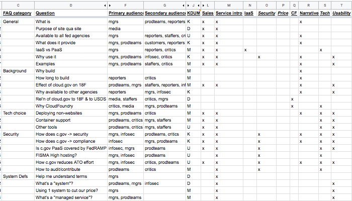
I rewrote the content in sections based on how audiences lined up with sets of question categories. This new IA enabled coherent reading about an unfamiliar product without jumping around. I forefronted the content aimed at audiences we were most prepared for (team managers rather than information security officers). And because the engineering knowledge of government CIOs and other managers is a mixed bag, and we didn’t yet have a good sense of what customers were going to ask for, I emphasized a collegial rather than technical tone throughout.
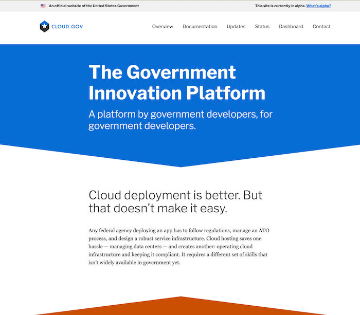
Then we needed a homepage. To help federal IT decisionmakers see that cloud.gov existed for them, I focused on how that sense of collegiality led our team to create a product engineered for government’s cloud technology needs.
To find the right overall tone, our team’s visual designer and I looked at the design choices of private sector cloud platform vendors. We tried to match the way they handled claims to credibility and ease of use, and we tried to contrast ourselves on claims of focus. We wanted to emphasize that cloud.gov was built by and for government employees, people who had worked within the government’s particular security compliance needs without sacrificing functionality or usability. We launched with a homepage that offered a high-level narrative of why the product exists and why government users should have confidence in it.
The work, again
After taking on a different project for a few months, I rejoined the cloud.gov team in 2016. After almost a year of selling and supporting customers on the platform, we had a storehouse of knowledge about what wasn’t working. I read through inquiries to the support inbox and sat in on customer and sales conversations. I conducted highlighter testing with people involved in selling other services that used cloud.gov to understand what potential customers were struggling to understand. If the website could better support these efforts, cloud.gov and sales of related services could see improved conversion rates.
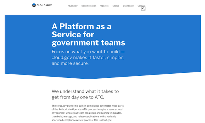
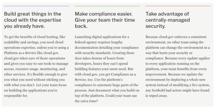
My research showed that the original language was too abstract and focused on our rationale. It didn’t address customer goals. I revised the content to emphasize what customers were trying to achieve. I also forefronted the requirements for using cloud.gov, which reduced time lost to impossible leads.
The results
cloud.gov’s initial direction gave the entire team a common, coherent story about the product, one that aligned everyone with the platform’s creator. It was flawed, but it gave us a great baseline for usability research and iteration. As we learned more about our customers, the content evolved. We could speak to their circumstances directly. The revised content led potential customers to ask confident questions more specific to their apps and teams when they contacted us about the product.
You can track ongoing changes to cloud.gov’s content on the cg-site GitHub repo